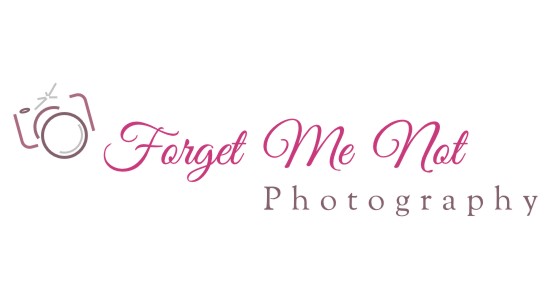
This logo design was based on the client’s request for a simple line drawing of a camera next to the business name, which could be used as a photo watermark.
The flamboyant font for the business name is tastefully contrasted with a more classic font for the word “photography”. This logo was produced in several color themes: classic grey, hot pink, and a reversed-color version for dark backgrounds.
Client’s response:
“That is exactly what I was looking for! …Thank you so much! I really like the color variations on the camera and the word Photography! It looks great!”
